
examples
What are some examples of visualizations?
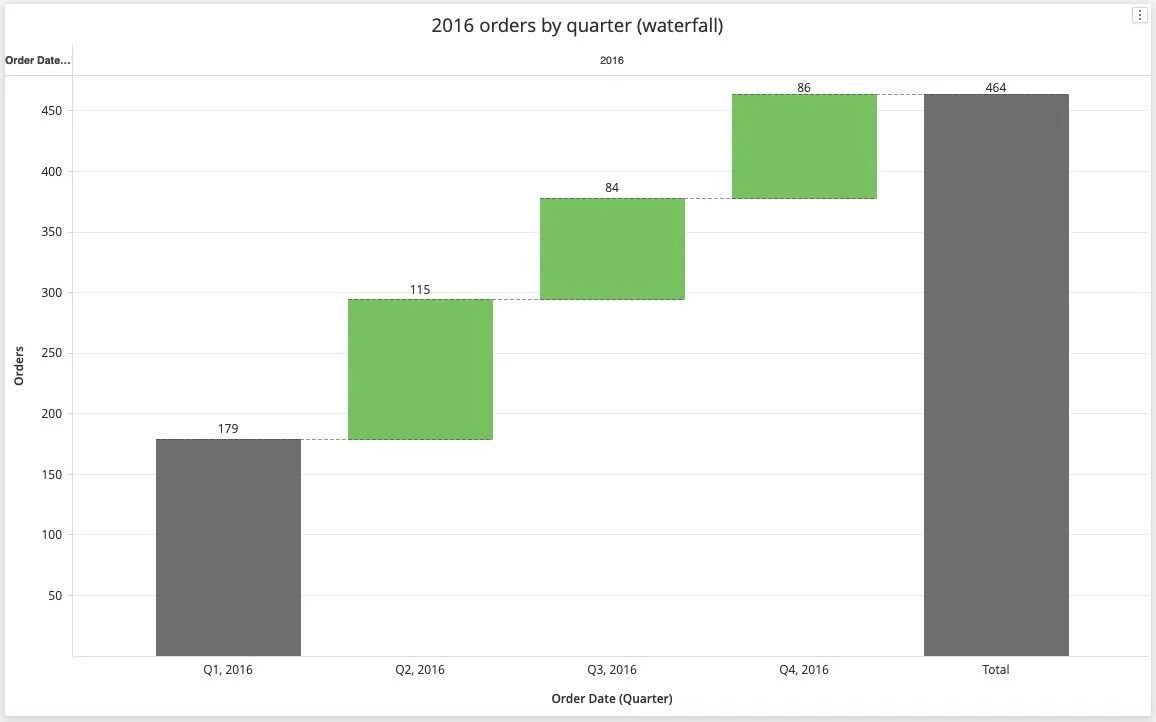
Each bar in a Waterfall Chart represents a step up or down in the value relative to the value of the previous bar.

A Heat Map uses colored rectangles to represent the magnitude of values within a matrix of categories or a grid of data points.
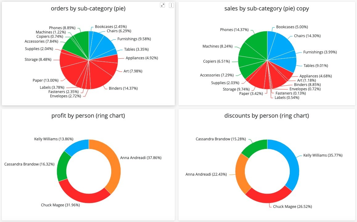
A Pie or Ring Chart is a circular visualization that is divided into slices, or sectors, each representing a proportion of the whole.
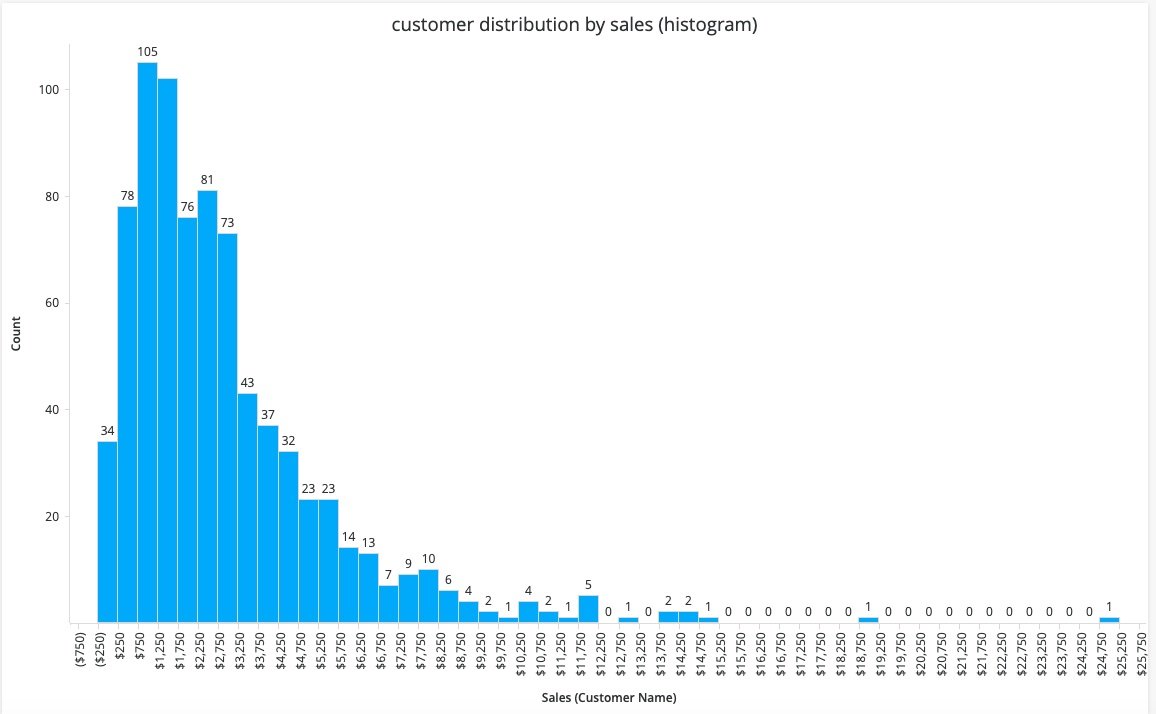
A Histogram displays the distribution of numerical data by grouping data points into specified intervals, called "bins."
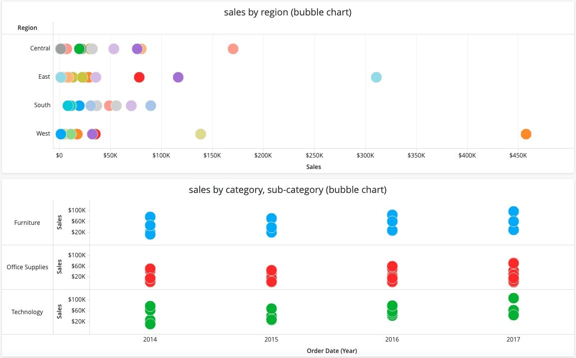
The Bubble Chart uses circles, or bubbles, to show relationships among three variables—X, Y, and bubble size.

Google Timeline tracks and visualizes activities over a period of time.
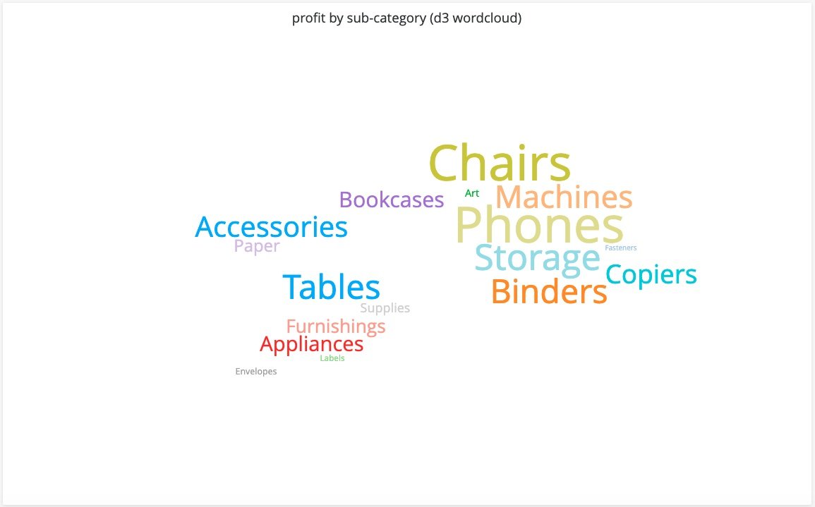
A D3 Word Cloud represents text data visually with word sizes based on frequency or importance.
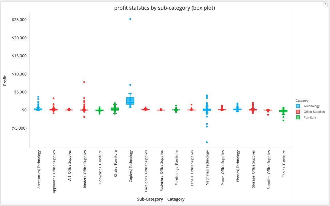
A Box Plot highlights distribution and variability of data with quartiles and outliers.
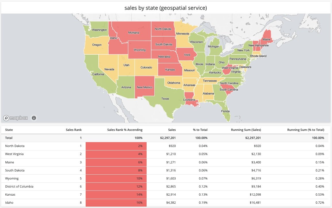
The Geospatial Service Map integrates maps to display data geographically, adding location-based context.

The Network visualization shows relationships between data points, illustrating connections and hierarchy, good for showing flow of data.
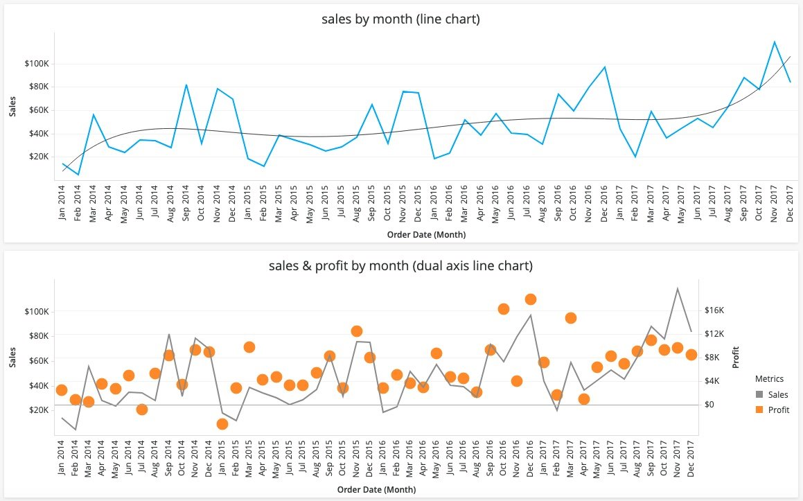
Line Charts display data points connected by lines to show trends over time or across categories, making it easy to spot increases, decreases, or patterns.

Grid, Compound Grid, and Modern (MicroChart) Grid.
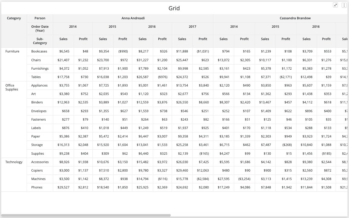
A Grid is a tabular display of data, similar to a spreadsheet, for easy viewing and comparison.
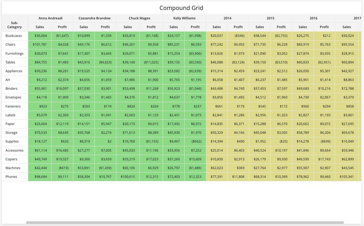
A Compound Grid Combines displays multiple independent grids.
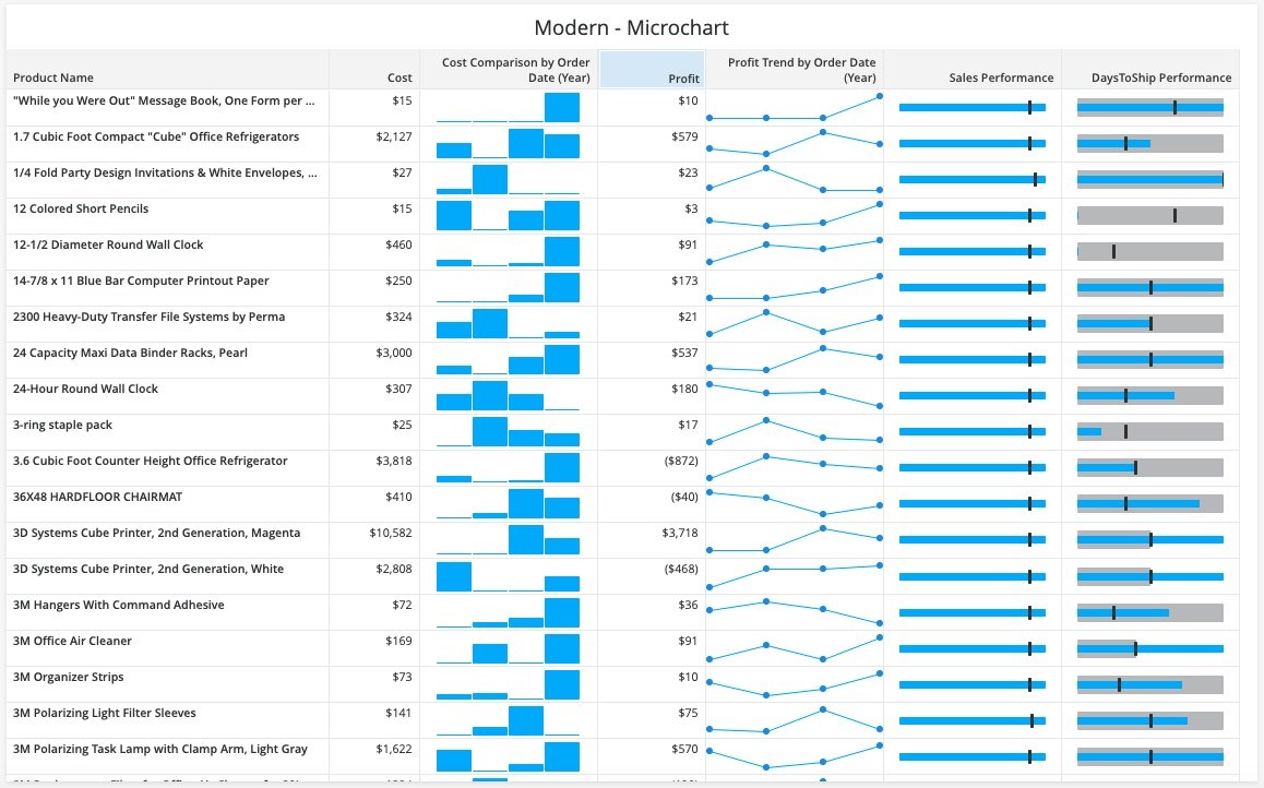
A Modern Grid, or MicroChart, contains tiny grid, line, bar, and bullet charts that provide quick snapshots of key metrics.
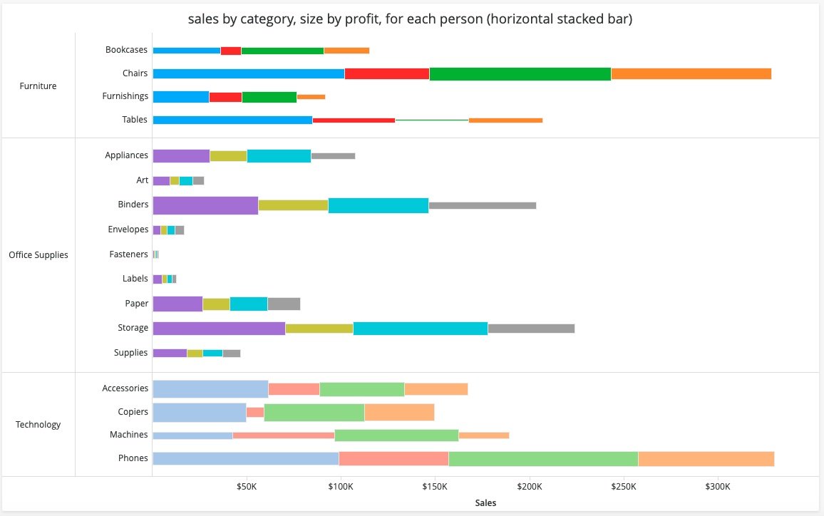
Horizontal Stacked Bar charts display categories as horizontal bars, with segments stacked to show the contribution of each part to the whole within each category.
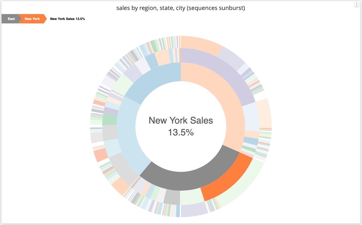
The Sequences Sunburst displays hierarchical data in a circular format, showing multiple levels in a compact view.
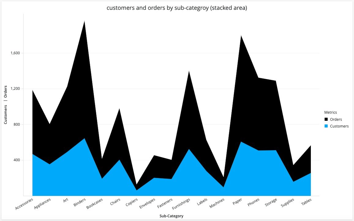
A Stacked Area Chart displays data segments stacked vertically, illustrating part-to-whole relationships and trends over time.
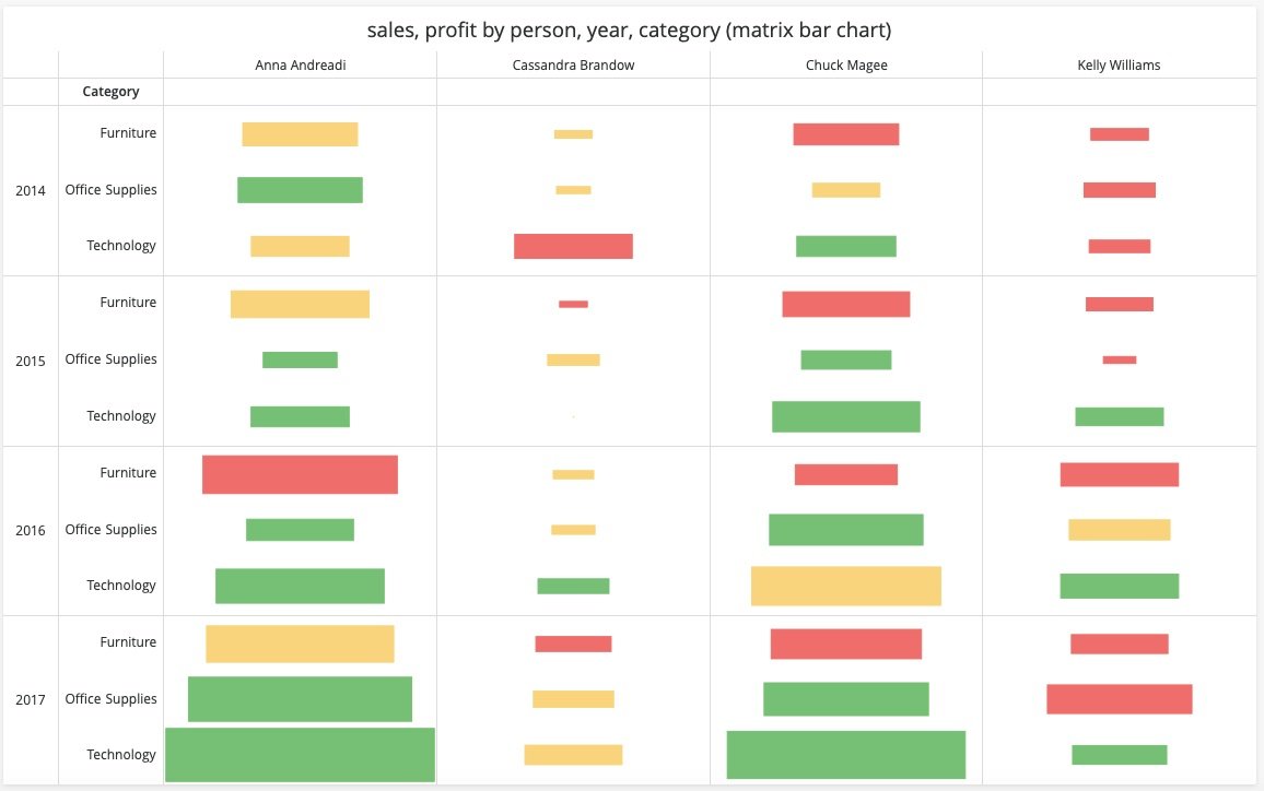
A Matrix Bar Chart visualizes data in a matrix format with bars, showing relationships among categories.
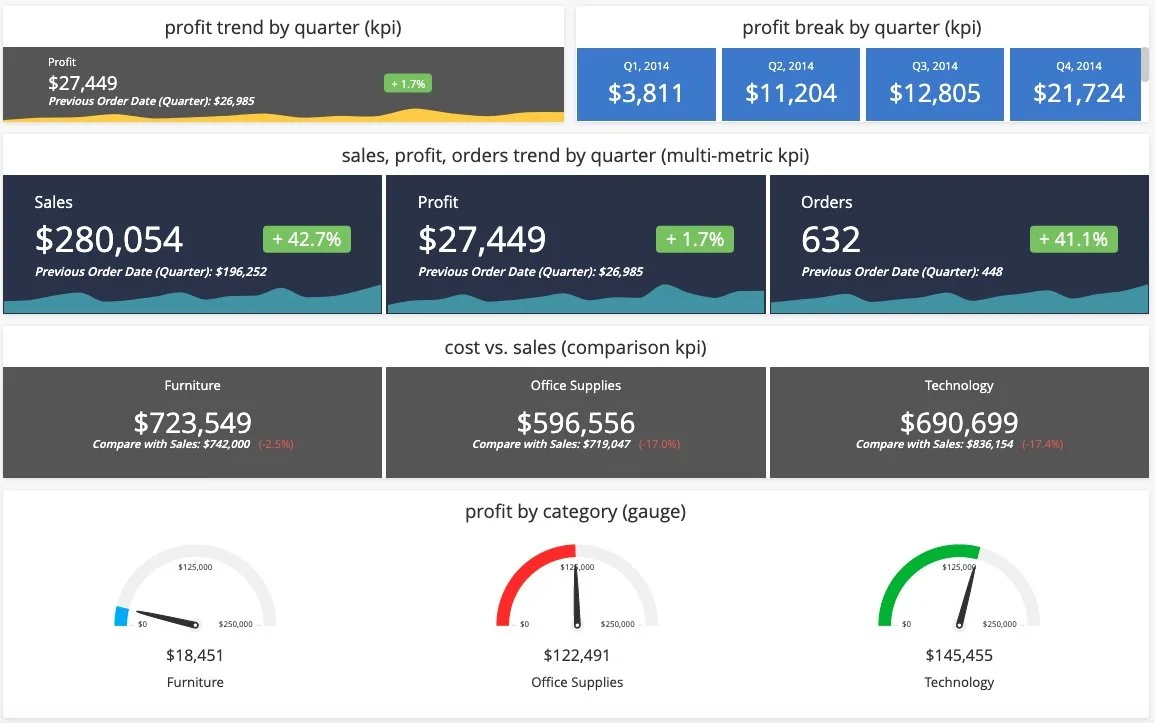
KPI and Gauge charts display Key Performance Indicators, often with color-coded status and trend indicators.
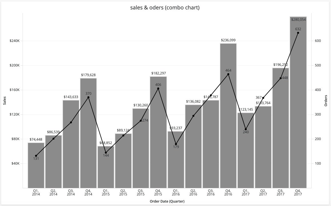
A Combo Chart Combines two chart types (e.g., line and bar) for comparative analysis within one chart, especially good for comparing values at different scales.